
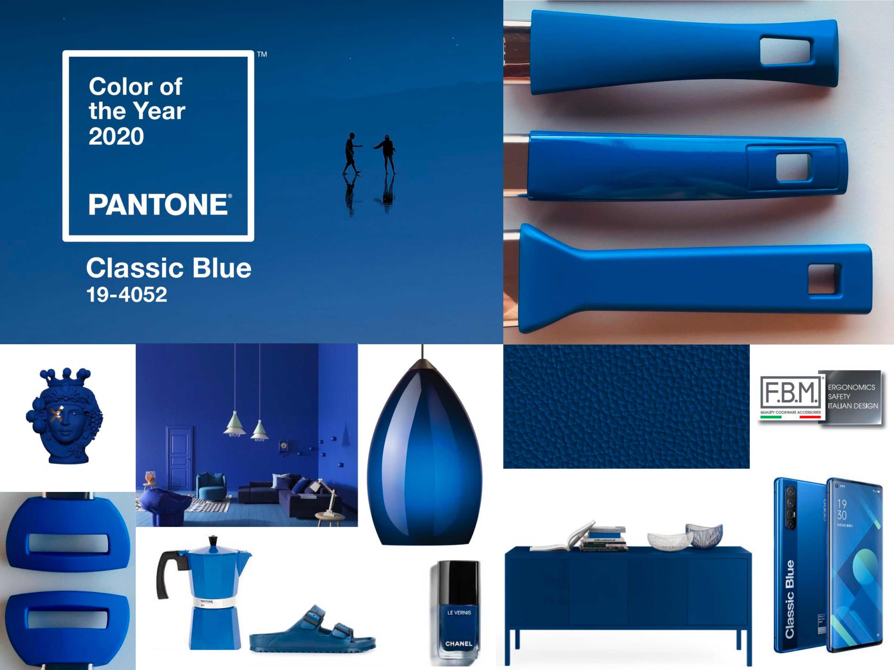
Pantone has announced that the 2020 Color of the Year is Classic Blue.
This shade is described as a “timeless and enduring blue hue elegant in its simplicity.” This deep tone brings to mind the calmness of the waters of a deep sea. Pantone Classic Blue was selected also for this reason.
There is no shortage of unrest in the world, and this color brings a sense of peace when used as a paint color. Pantone’s Color of the Year choice also spills over into many different areas as well, including cookware.
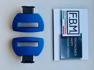
In the cookware design industry, companies can incorporate the latest color trends into their product lines without necessarily having to introduce a complete update. Not all brands want to make a major change to their style but may be open to updating their cookware handle offerings. In the case of Classic Blue, applied to cookware accessories, you can play with different options of finishes to further differentiate your line.
Classic Blue handles, side handles and knobs can be made in comfortable soft touch, elegant matte or brilliant glossy. Consider that in a glossy finish it would stand out and attract the eye, while in a matte finish it would have a trendy appearance. Soft touch on the other hand is always a good choice for enhancing product’s ergonomics thanks to the pleasant feeling it gives to the hand grip.
WHEN YOU SHOULD (AND SHOULD NOT) FOLLOW COOKWARE TRENDS
Responding appropriately to customer needs, from initial contact through sales to aftercare is the most important undertaking of every company.
All new trends should always be examined with a critical eye but, offering something fresh and new playing with colors trends and using Pantone resources is a nice and appreciated option.

A designer may follow certain cookware trends that appeal to the tastes of customers in a wide audience.
The goal is to try to find some type of “middle ground” in design that will appeal to most customers and sell well without issues.
 Do you follow a trend or not? The answer lies in whether or not the trend reflects your brand and its mission statement. For example, Pantone’s Color of the Year for 2020. Think of the deep blue tone of Classic Blue and what it brings to mind.
Who would be interested in purchasing cookware featuring this color?
This is a color that a customer could buy in 2020 and it will still look good a decade from now. Classic Blue is a trend that will look new going forward.
Our Suggestions
We suggest that you take the best ideas from trends and use them to create collections that are fresh and interesting. Ideally, you’ll want to find ideas that appeal to people who enjoy spending time in the kitchen that reflect your brand and its public appeal. One way to do this is to take a trendy color like Classic Blue and use it for certain parts of pots and pans. The color can be for the handles only or to combine different materials that express a sense of timelessness and security.
Contact us to request samples of our handles in the colors and finishes you are interested in. We will provide them so you can plan your next cookware collections.
