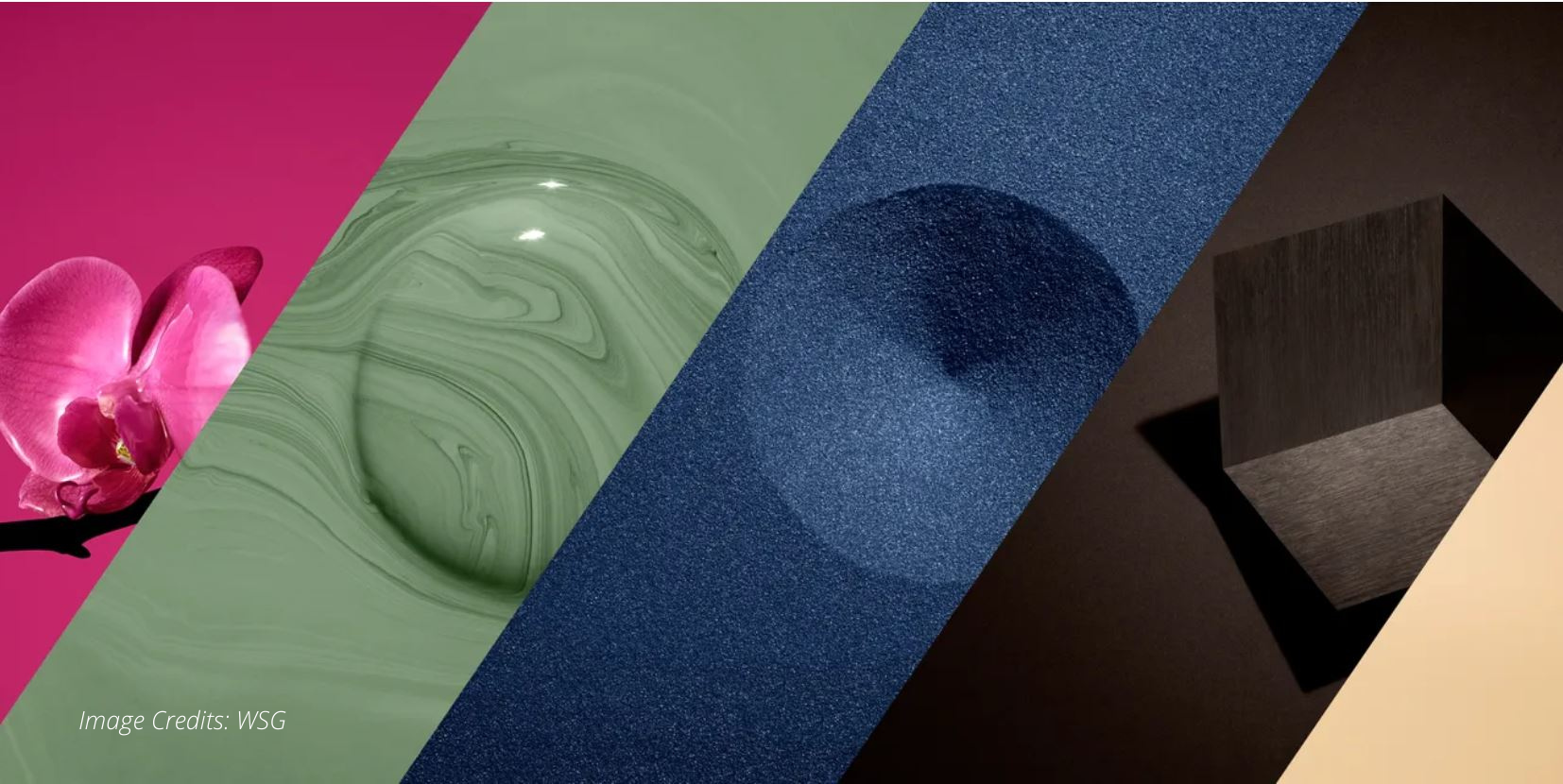
Color is still one of the principal medium used to share a message in cookware and bakeware design. The selected tone immediately creates an impact. The product color conveys a feeling about its features, functions, and value. The pandemic is having a significant influence on consumer buying patterns.
Consumers spend more time considering the functionality of a product before buying it. They want products that promise to provide a sense of wellbeing. More than ever hygiene is an important consideration to avoid spreading bacteria-causing disease. And other key aspect, corporations are embracing sustainability when choosing raw materials and setting production policies.
How will color trends impact cookware? La Termoplastic F.B.M. considered the influence of color on consumers.
COLOR has POWER
Color is a significant part of all consumer products. It is an essential part of the design process and is critical to attracting customers. Changing the color of a cookware and bakeware line is an effective way to:
- Represent part of the brand image
- Show the market level of a product at a glance
- Designate a product line update
Interesting research developed by CivicScience, shows that consumers are divided on the importance of color when buying cookware. 53% of respondents said it was an important consideration, while 47% stated they did not consider color when making their choice.-1.png?width=300&name=Progetto%20senza%20titolo%20(1)-1.png) Women were more likely to say that color was an important consideration when choosing cookware than men. Fifty-two percent of women stated that it was significant to them. Only 40% of men agreed.
Women were more likely to say that color was an important consideration when choosing cookware than men. Fifty-two percent of women stated that it was significant to them. Only 40% of men agreed.
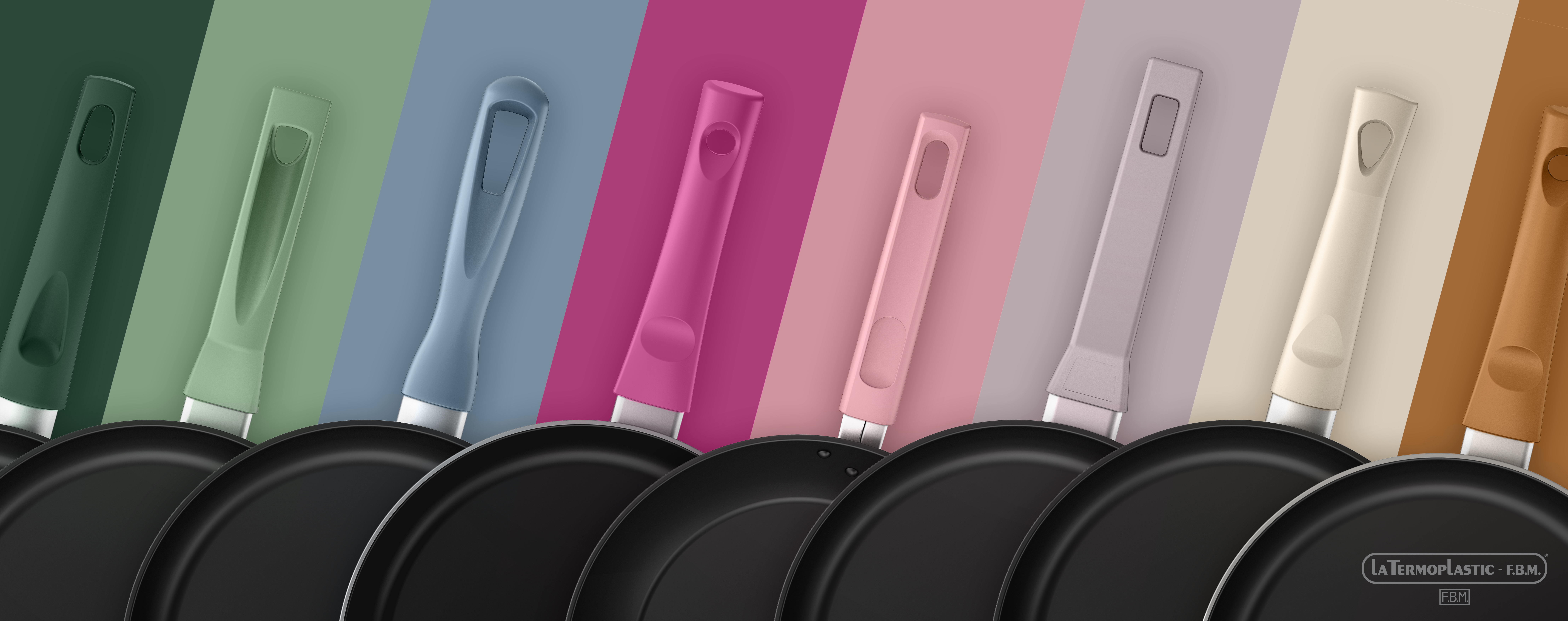
Interestingly, the Color Report of Cookware Manufacturing Association found that the cookware market uses traditional, classic colors to line pots and pans. For the outside of the pan, brands are experimenting with new colors. Red, blue, and black are still the dominant colors in cookware.
F.B.M. explored the upcoming design color trends for cookware in 2022, download our Trend Book to get a comprehensive overview on newest colors for cookware. Here a sum up for you.
What’s New About Color?
The top design color trends are as follows:
- Neutrals: Consumers were drawn to natural tones in their homes as a way to relax and reduce stress. Neutral tones and pastel shades are thought to create feelings of calmness and serenity.
- Quiet Pastels: These colors combine the need for calm and quietness with warm vintage tones that are clear and fresh.
- Nature Healing: This color group brings sustainability to mind. Its calming tones create a harmonious backdrop that connects the room’s occupant to the outdoors.
- Pureness: The Pureness color group satisfies the consumers’ need for cleanliness and reliability. These tones have a futuristic quality about them.
Brands are prioritizing grounded shades that project a sense of calm during these uncertain times. The colors of A/W 22/23 are rich looking and give the viewer a feeling of grounded optimism. The colors represent a plant, food, or a material prized in the past. We are reacquainting ourselves with previous values and evaluating how they can be applied going forward.

F.B.M. COOKWARE TRENDS FOR 2022 and beyond
This year we decided to develop a new TREND BOOK focused not only on colors but also on the main trends in the industry that will undoubtedly contribute to redefining the home and lifestyle concept. Analyzing what have been the megatrends of this last period, we tried to find new ways to experience the home (e.g., smart working, sanitation, and well-being) and new ways to feel connected with our community.
A trend book full of hints and curiosities about a sector, the cookware one, that is evergreen and is constantly evolving.
For further information contact us today to schedule a consultation to see the latest related products.


